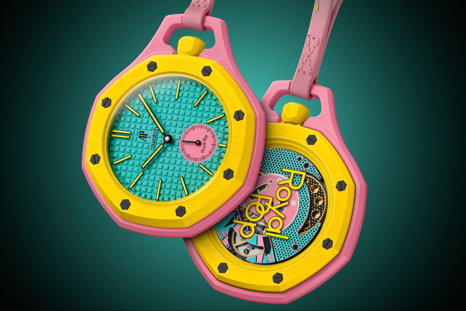
Audemars Piguet Swatch Collaboration: The unexpected collaboration merges haute horlogerie precision with Swatch’s democratic design ethos, landing this month in a spectrum of statement shades.
The Audemars Piguet Swatch collaboration rarely sees a collision of this magnitude. Audemars Piguet, the Swiss manufacture whose Royal Oak defined luxury sports watches for half a century, has partnered with Swatch to create something that shouldn’t work on paper but somehow does: a pocket watch that channels the iconic octagonal silhouette of AP’s most legendary design while embracing the pops of color and accessibility that made Swatch a cultural institution. The Royal Pop pocket watch lands in eight distinct colorways, each one a deliberate statement about what happens when watchmaking’s old guard meets its young democratic rebel.
On the surface, this reads like every other luxury-meets-streetwear collaboration that’s become almost routine in fashion and lifestyle. But the partnership operates on a different frequency. Audemars Piguet isn’t diluting its identity to reach a younger audience. Instead, the brand is extending a visual language so strong that it transcends price point and prestige. The Royal Oak’s geometry, those eight screws visible on the bezel, the integrated bracelet proportions, these are design DNA so potent that they remain recognizable even when executed in plastic, even when sold at a fraction of a traditional AP’s cost. Swatch, for its part, isn’t playing dress-up in borrowed finery. The brand is doing what it does best: translating design concepts into objects that are genuinely wearable and genuinely fun.
The Audemars Piguet Swatch Collaboration That Changed the Game
The color palette is where Royal Pop reveals its true ambition. Eight colorways means eight different conversations about the same watch. This isn’t a black dial, a blue dial, and maybe a white dial situation. This is a full spectrum approach to a pocket watch, a format that’s mostly existed in conservative territory for decades. Each shade carries weight, carries intentionality. Without the specific colorways listed, what matters is the sheer breadth of the offering. Eight is a statement of abundance, of refusal to edit down to safety. It’s Swatch’s philosophy coded directly into the product mix: watches are for expression, and expression demands options.
The pocket watch format itself is a curious choice for a modern collaboration. It’s not a wristwatch, so it’s not claiming to be your daily tool. It’s not a dress watch, exactly, though it could function in that role. Instead, it exists as a hybrid object, something you pull out, something you display, something that becomes a gesture. Pairing that retro-forward format with contemporary colorways creates an interesting temporal confusion. Is this vintage? Is it new? Is it ironic? The answer is probably yes to all of it, and that ambiguity is precisely where the design lives.
The DNA That Travels Across Price Points
What makes this collaboration actually function is that the Royal Oak design is powerful enough to survive translation. The octagonal case has been a symbol of AP’s entire identity since 1972, and it’s remained so legible that even a casual observer can recognize it. That kind of iconic power typically stays locked behind price tags. Here, it’s been democratized in the truest sense: same shape, same proportions, same immediate recognizability, different material and cost structure. This is what true design collaboration looks like. Not a downmarket knockoff, not a one-way gift from luxury to accessibility, but a genuine exercise in whether a design concept is as strong as we’ve been told it is.
Swatch has always understood something that luxury brands often miss: design doesn’t require expense to be meaningful. A watch that costs less than dinner out can carry as much visual intention as one that costs a car. The Royal Pop pocket watch proves that thesis in real time. This isn’t about creating a “gateway drug” to Audemars Piguet, though some people will certainly experience it that way. It’s about acknowledging that good design has a shape and a presence, and that shape doesn’t need to apologize for its materials or its price to be legitimate.
The pocket watch format adds another layer of cultural specificity. This isn’t a watch you wear every day, at least not in the contemporary sense. It’s an object you access intentionally, you retrieve, you reveal. That ritual dimension is worth noting. Swatch has built its entire practice around the wristwatch, the democratic watch, the watch for everyone. A pocket watch is more formal, more considered, more architectural in how you interact with it. By choosing that format, the collaboration signals something: that there’s room in the contemporary moment for objects that aren’t optimized for constant connected life, that there’s still pleasure in a watch that requires you to slow down just slightly to know what time it is.
The eight colorways, the pocket watch format, the octagonal silhouette, the fusion of two radically different design philosophies, these add up to something that works because it refuses to apologize for what it is. It’s not trying to trick anyone. It’s a pocket watch with Audemars Piguet’s most famous design language, made by Swatch, in colors that demand attention. That’s the entire proposition, and it’s enough.