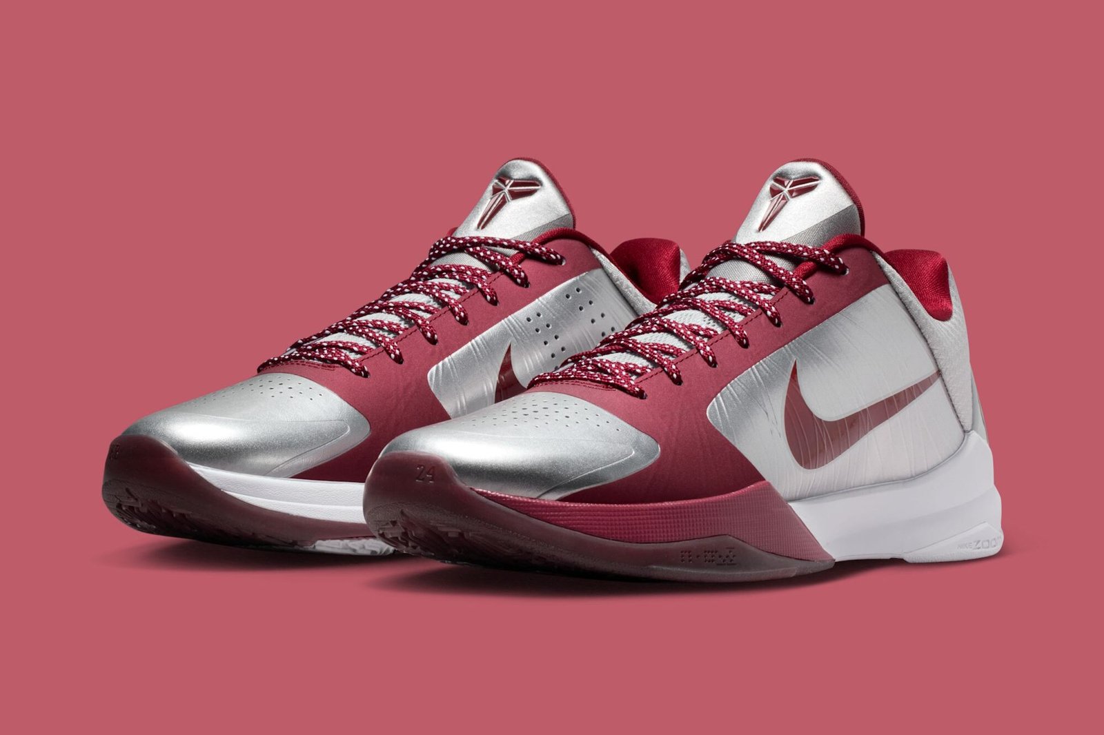
A split menta and blue glow design captures the city’s duality on Kobe’s modernized classic.
Nike’s latest Kobe 5 Protro colorway arriving this summer is built on a premise that only makes sense in New York: two halves of the same city, two distinct energies, one sneaker. The ‘NY vs. NY’ edition splits the court down the middle with menta green dominating one side and electric blue glow taking the other, a visual metaphor for the city’s geographic and cultural fault lines that has defined everything from basketball to hip-hop for decades.
The execution sits firmly within Kobe’s modernized prototype era. The Protro line has spent the past few years stripping down the original 2009 silhouette to its mechanical essentials, cleaner panels, stripped-back colorblocking, tighter cuts around the collar. That restraint works here. The menta-to-blue split isn’t chaotic; it reads as deliberate geometry, the kind of design move that feels inevitable once you see it but that most brands would overthink into something worse. The heel and forefoot land in distinct color zones, making the division legible without requiring explanation.
For collectors and New York sneakerheads specifically, the cultural load here cuts deeper than pure aesthetics. The Kobe 5’s original 2009 run was built on accessibility and performance crossover at a moment when both mattered equally. This Protro version, arriving as part of Nike’s broader summer campaign, leans into that same accessibility while acknowledging what the shoe has become: a symbol tied to specific cities and specific moments. The ‘NY vs. NY’ treatment doesn’t try to pick a side. It celebrates the fact that the city has never had just one identity to begin with.